LIVO / JULES — DESTINOS
EYEWEAR · COLOUR · MATERIAL
COLOURREMEMBERS.
Bonito. Amazônia. Natal.
Three places remembered through colour, translated into acetate. A new capsule for one of LIVO’s signature frames.

LIVO JULES / DESTINOS
Somewhere,
in a colour.
“It’s not about where you are,
it’s about what your palette remembers.”
COLLABORATION
MILOSSI × LIVO
THE PROJECT
A signature frame revisited through colour direction, acetate combinations and laminated construction.
A SHAPE WITH A HISTORY
c. 2011
The beginning of JULES
A familiar face.
A new way to feel it.
JULES was among the first five frames Lucas Milossi designed for LIVO, around 2011. It became a signature of the brand and has remained part of its story ever since.
Destinos returns to that established shape. Its rounded lenses, defined upper corners and keyhole bridge become the constant around which a new colour story can unfold.
The capsule explores how an existing design can acquire a different atmosphere through the material itself.
THE COLOUR STORY
A landscape can stay
with you as a palette.
The collection began with a feeling: water, forest, wind over sand. Blue, green and beige became a language for those memories. The references guide the colour and mood; the frame carries the experience into an everyday object.
DESTINOS / 01
Bonito
Blue that breathes like water.
Deep blue, bright blue, transparency. Bonito brings the sensation of water into the acetate: colour that shifts with light, held inside the familiar JULES outline.

DESTINOS / 02
Amazônia
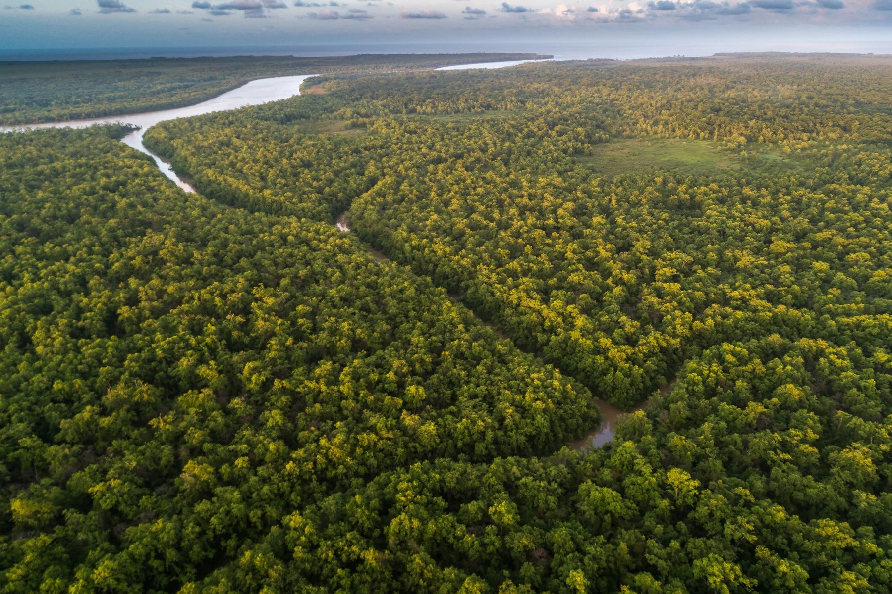
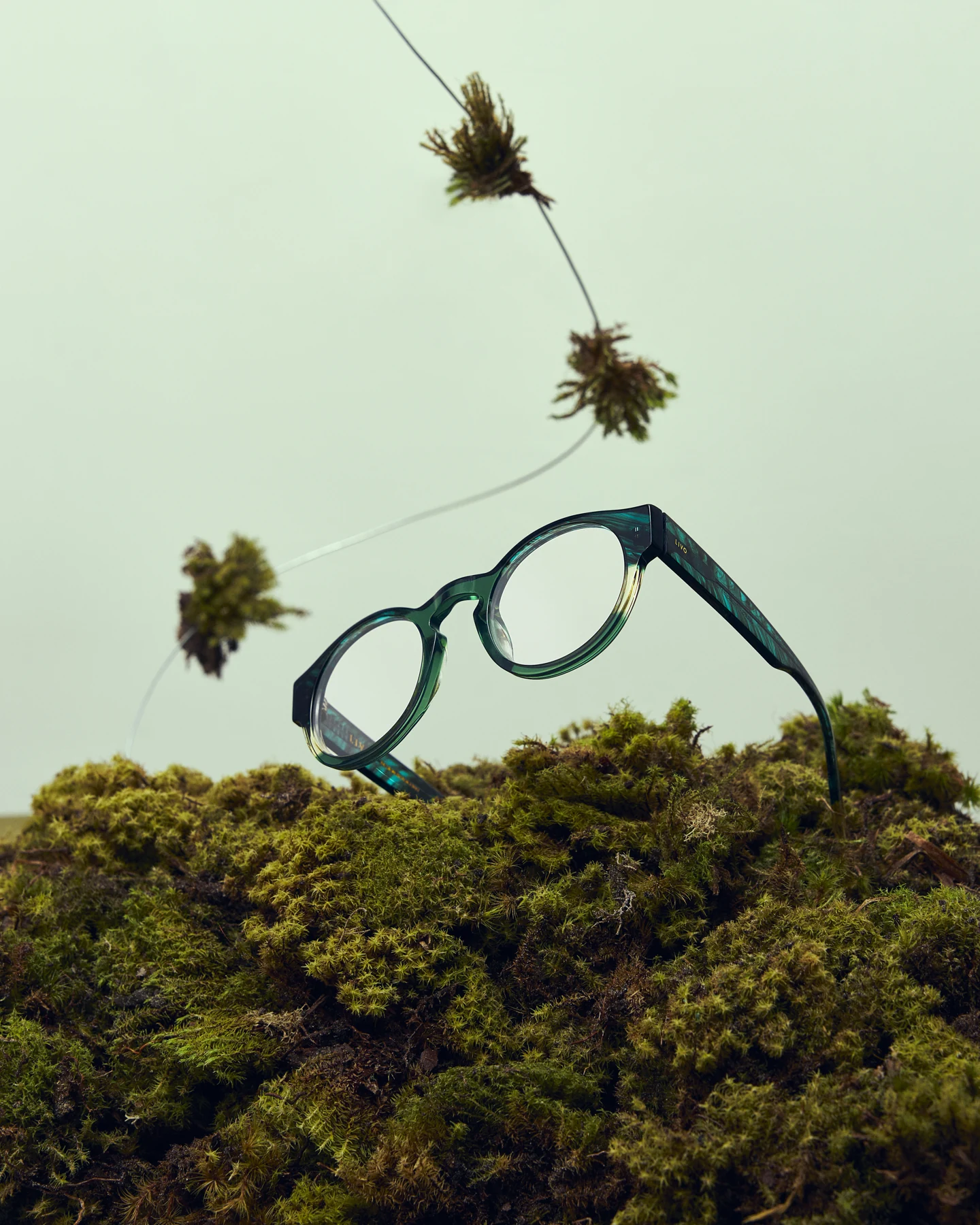
Green that grows like rhythm.
A canopy of greens, dark intervals and glints of light. Amazônia translates that layered rhythm into a frame whose colour feels alive as the viewpoint changes.
DESTINOS / 03
Natal
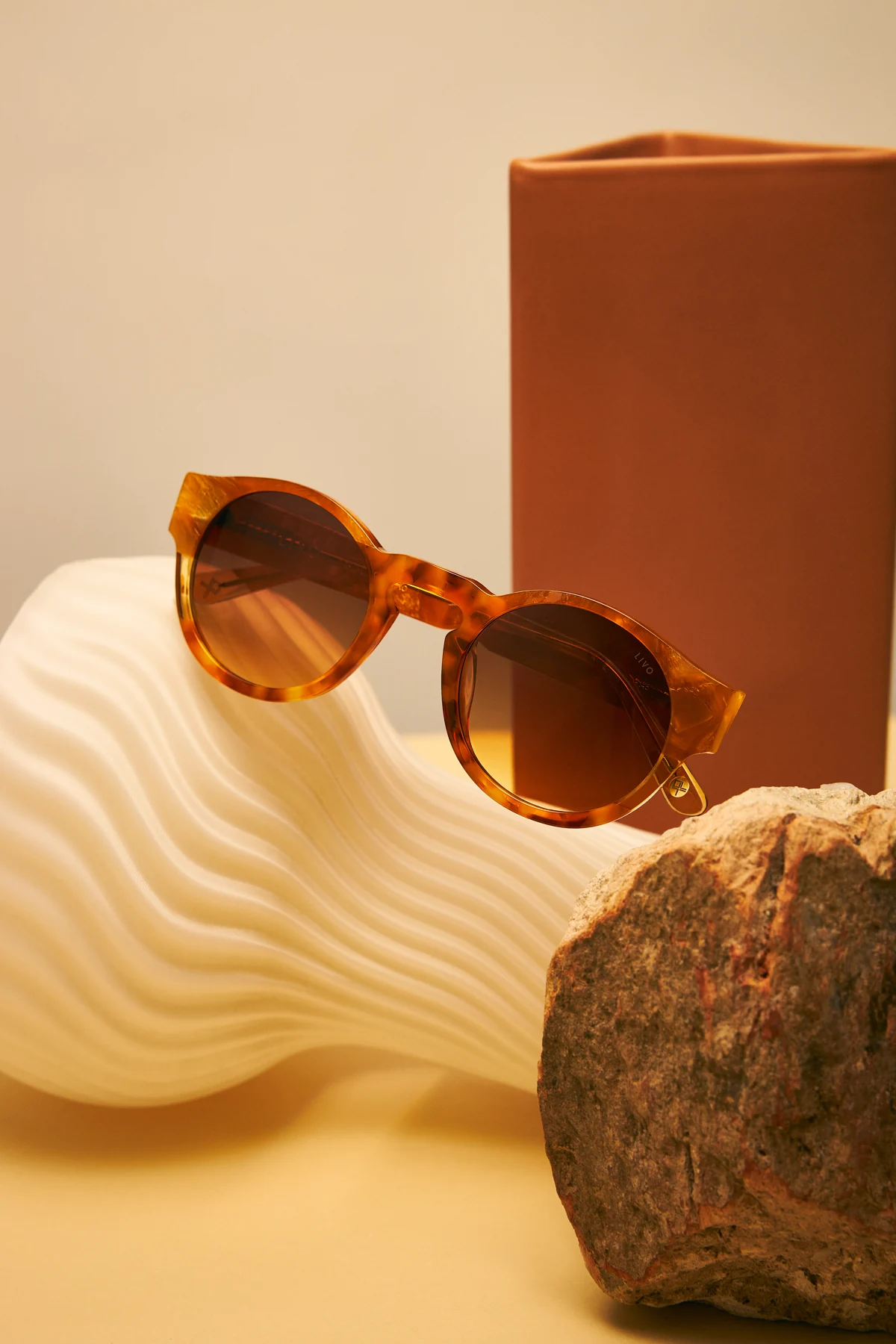
Beige that moves like wind.
Sand, warm light and amber. Natal carries the softness of the dunes into a warmer expression of JULES, photographed here as sunglasses with brown gradient lenses.

THE MATERIAL LANGUAGE
Colour, built
into the frame.
Lamination brings different pieces or layers of cellulose acetate together. Through bonding — incollaggio in Italian — selected colours and patterns can form a continuous composition that is then shaped and finished.
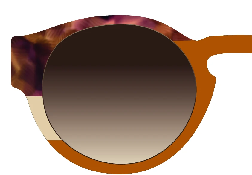
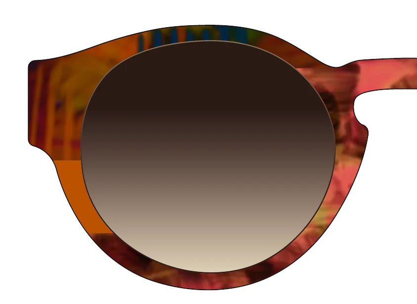
For JULES, that opens up a precise design question: where should one colour meet another? A change at the brow, the bridge, the lower rim or the temple can alter the character of the same silhouette.
About acetate lamination
Acetate can be combined in layers or joined in sections, depending on the intended effect and construction. The exact bonding method depends on the materials and manufacturing process.
Material background: Mazzucchelli 1849 — materials and processing ↗FROM THE DEVELOPMENT ARCHIVE
One outline.
Many compositions.
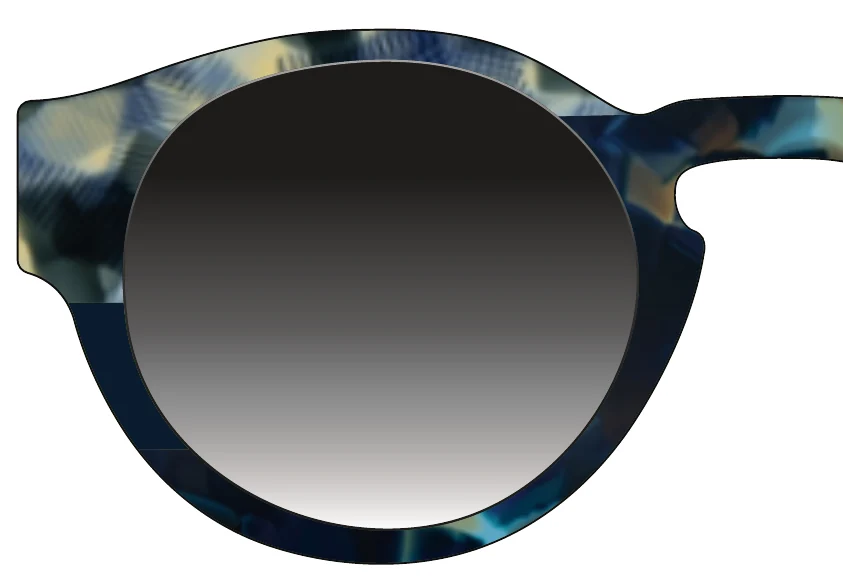
The colour studies explore different placements of solid and patterned acetate. Looking at a fragment brings the join into focus: a contrasting segment, a shift in transparency, a line of colour around the lens.
These are proposal details from the development document, showing the exploration behind the collection.
MILOSSI × LIVO
A lasting shape.
New memories.
Destinos brings blue, green and sand-toned warmth to a frame with a long history. The collaboration with the LIVO team carries that continuity forward through colour, material and a shared attention to the object.
Original JULES design: Lucas Milossi for LIVO, circa 2011. Destinos capsule: developed in collaboration with the LIVO team. Collection photographs, visual references and design excerpts supplied from the project archive. Genipabu reference photograph credited in the supplied file to Ricardo Rollo / Embratur. Colour swatches and the lamination diagram are interpretive illustrations for this case study.