A BOLD MARK.
A QUIET FINISH.
MILOSSI’s rebranding and helmet packaging for GP23. A graphic identity carried into an object through colour, flowing lines and the contrast between matte and gloss.
 BLACK. RED. WHITE.
THEN LIGHT.
GP23
Rebranding · Packaging graphics · Finish specification
2024
01 / THE IDENTITY
One mark.
A clear system.
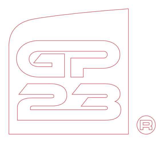
The rebranding brings GP and 23 into a compact badge, with an angled upper edge and a rounded corner. A horizontal configuration gives the identity another format to work with.
The manual defines the logo variations, alignment and a restrained black, red and white palette. On the packaging, the red badge becomes the immediate point of recognition.
 01 / CONTOUR02 / ALIGNMENT
02 / FROM MARK TO OBJECT
Let the line
travel around it.
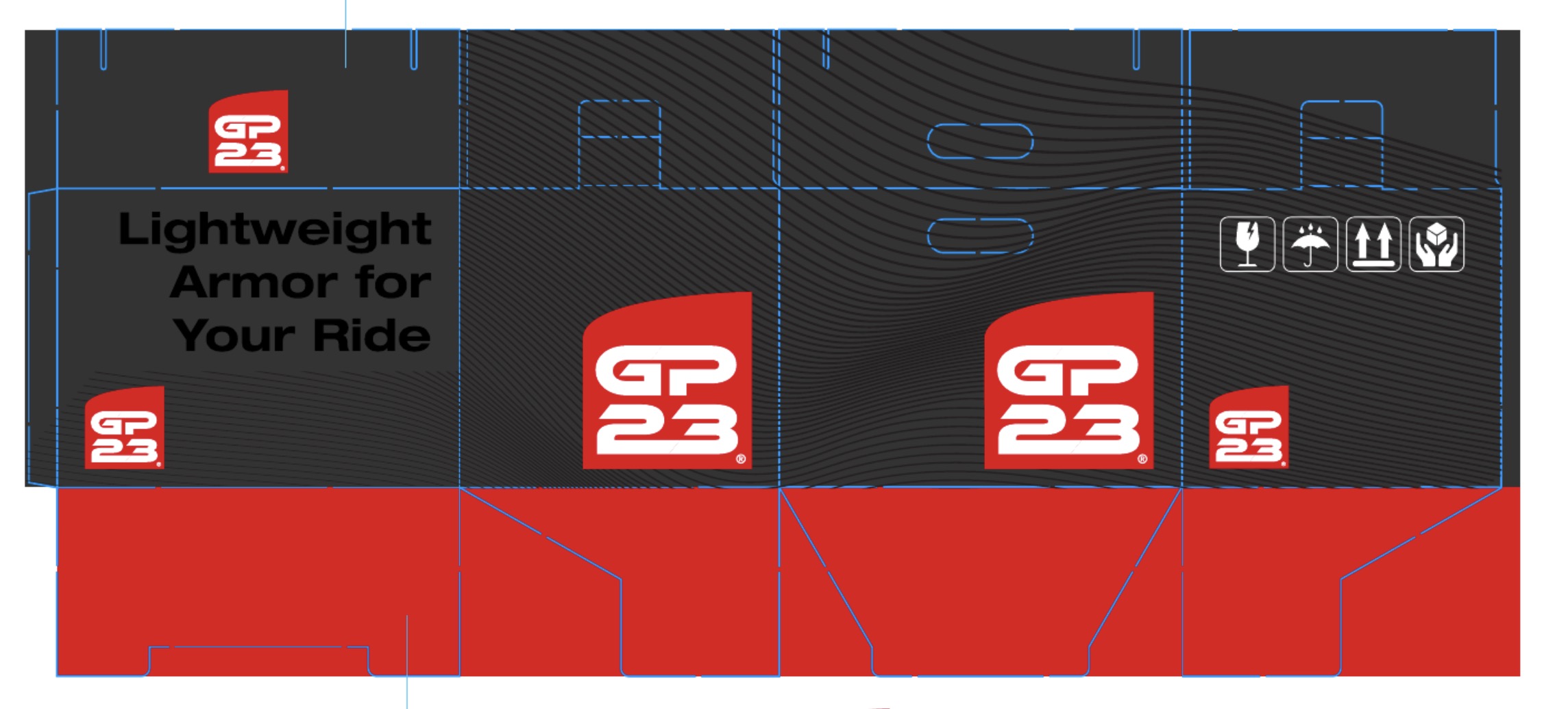
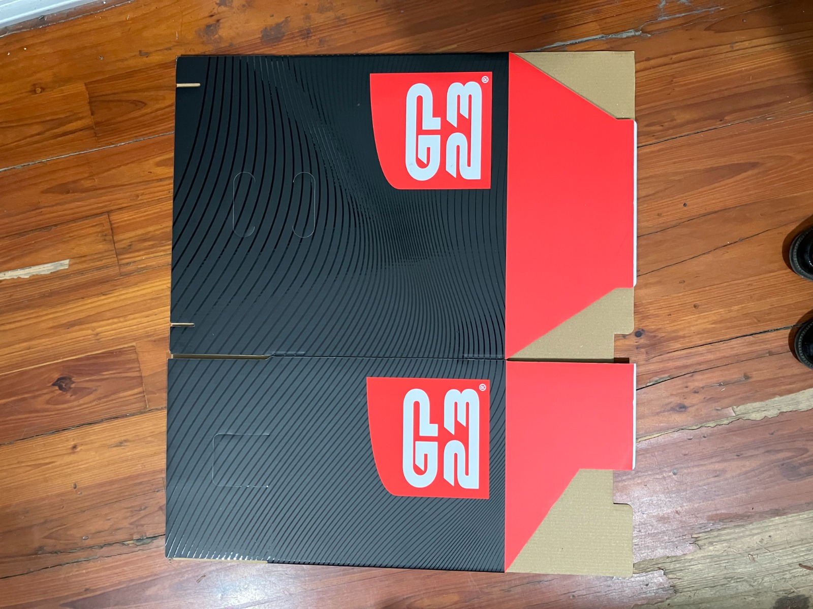
The artwork connects the faces of the carton. The flowing pattern gives the black surface direction, while the badge and red flaps establish the colour hierarchy.
03 / THE DECISIVE DETAIL
SHINY/MAT.
Same black.
A different response to light.
ON A MATTE BASE
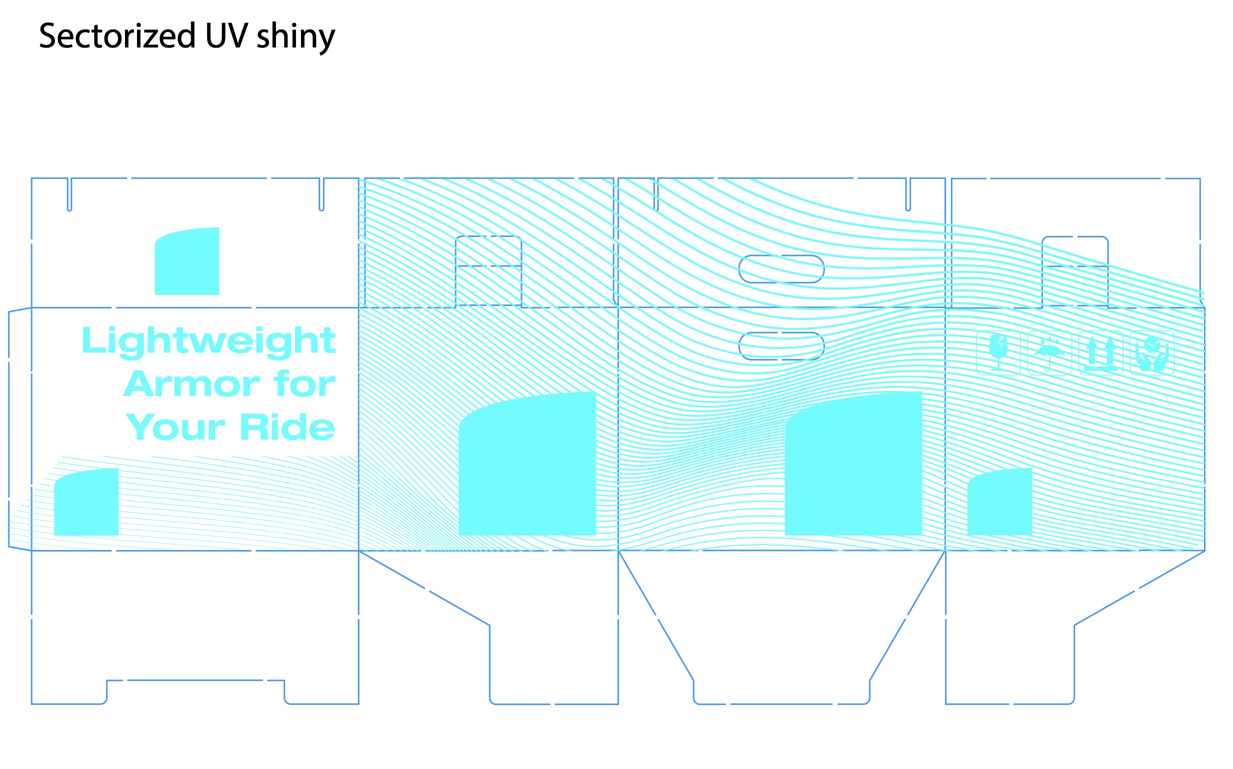
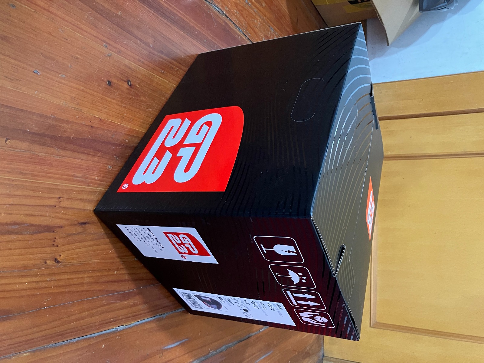
The packaging specification separates the matte base from a selective gloss UV layer. The line pattern and selected graphic elements catch the light; the surrounding surface stays visually quiet.
That contrast is the defining feature of the box. Its appearance changes with the viewing angle, giving a mostly black package another level of detail.
04 / DEFINING THE FINISH
Two layers.
One surface.
Explore the original colour layout and its separate gloss UV mask. The cyan in the mask identifies the finish areas; it is not an additional printed colour.
05 / IN THE HAND
The drawing.
The real thing.
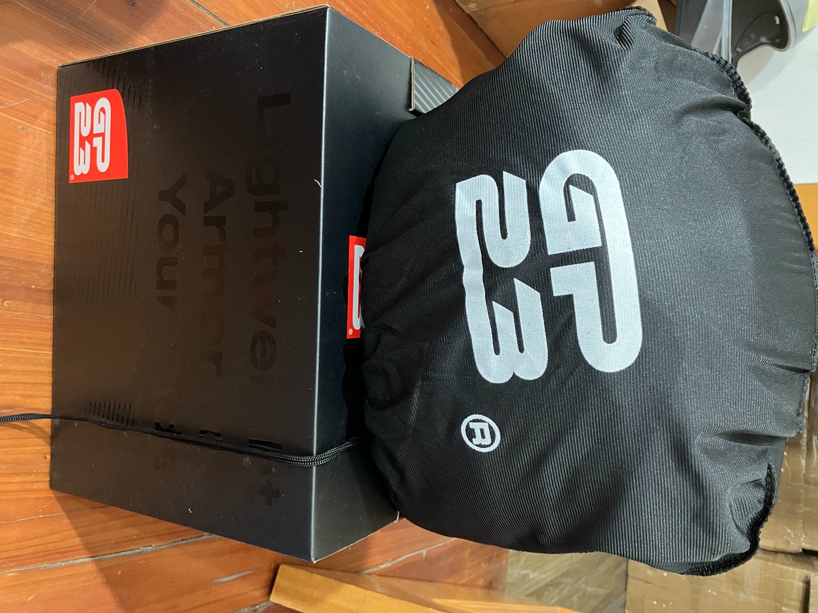
The production photographs show the finish across the printed carton and the identity on the protective helmet bag. The brand carries from the box to what is inside.
Rebranding and packaging design: MILOSSI. Original artwork and production photographs from the GP23 project archive. Explanatory line studies created for this presentation.